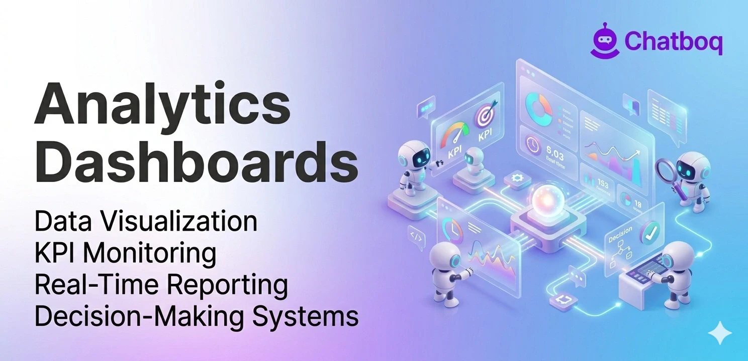
Key features include data visualization through charts and graphs, real-time data updates, customizable views and filters, KPI tracking with alerts, and integration with multiple data sources.
Data visualization (charts, graphs, tables)
Visualization is a dashboards' defining feature fundamentally. Visualization tools such as charts and interactive graphs help operational dashboards display performance metrics effectively.
Line charts show changes over time clearly. Bar charts compare values effectively. Pie charts show composition. Area charts emphasize magnitude. Different visualization tools support different dashboard analytics and operational reporting requirements. Interactive charts and visualization tools help teams interpret dashboard analytics and performance metrics more efficiently.
Graphs use spatial relationships to show patterns effectively. Scatter plots reveal correlations clearly. Heat maps show intensity variation. Network diagrams show connections. Good visualization makes patterns obvious instantly. Visualization tools improve dashboard analytics usability by simplifying operational reporting and performance tracking. Humans see patterns in graphics instantly without effort or training.
Real-time data updates
Real-time updates mean current data constantly. Dashboards refresh continuously or frequently. Changes appear within minutes. Teams see current status, not yesterday's status. Real-time data enables real-time response. Timeliness matters critically in fast-moving businesses.
Update frequency varies by use case. Operational dashboards might refresh every minute. Strategic dashboards might refresh hourly. Financial dashboards might refresh daily. Frequency depends on decision-making needs. More frequent updates cost more. Balance frequency with cost and needs appropriately.
Customizable views and filters
Analytics platforms provide customizable dashboard reporting views for different operational teams and business functions. Sales managers need sales dashboards. Marketing managers need marketing dashboards. Operations managers need operations dashboards. Customization enables each team to see relevant information. Relevance improves adoption and engagement.
Filters enable exploration deeply. Teams can drill down. They can focus on specific regions, products, time periods. Dashboard filters support deeper operational reporting analysis by allowing teams to evaluate specific business metrics and performance trends. Dashboard filters improve dashboard analytics by helping teams compare operational data across products, regions, and time periods. Filtering works without overwhelming complexity or data overload.
KPI tracking and alerts
KPIs represent business metrics that operational dashboards and KPI monitoring systems track continuously. Revenue, conversion rates, customer satisfaction, and support response time are critical business metrics within dashboard reporting systems. Dashboards track all KPIs. They show progress toward targets. They highlight metrics that require attention. Alerts notify immediately of problems.
Alerts notify teams of problems. If revenue drops below target, an alert appears. If support response time exceeds threshold, alert appears. KPI alerts help operational dashboards notify teams about performance issues requiring immediate investigation. Alerts enable quick response to issues.
Integration with multiple data sources
Dashboards pull data from everywhere. CRM systems provide sales data. Analytics tools provide website data. Databases provide operational data. Spreadsheets provide legacy data. APIs connect to external platforms. CRM integration, API integrations, and data aggregation systems improve reporting dashboards by consolidating operational data from multiple systems. Integrated reporting systems improve business intelligence dashboards by combining operational reporting and dashboard metrics across business operations.
Operational analytics architecture depends on standardized data transformation processes to maintain reporting accuracy across analytics platforms. Data from different sources uses different formats. Integration unifies formats. This standardization enables accurate analysis. Integration enables consistency across all data.


Leave a Comment
Your email address will not be published. Required fields are marked *
By submitting, you agree to receive helpful messages from Chatboq about your request. We do not sell data.